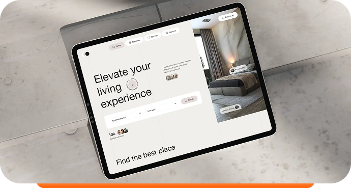
My website design service is a comprehensive solution tailored to help businesses build a strong digital presence. Whether you’re a coach, startup, service provider, or running an eCommerce store, I design custom websites that are not only visually appealing but strategically built for growth. Every site is mobile responsive, optimized for fast loading, and includes essential SEO setup to help you get found online. With a user-focused approach,
Development
Web Design
Webflow
Fintech
HR & Recruitment
Our team had to find a stylistic approach to the website that would effectively uncover the benefits of the financial service for the businesses in a friendly and engaging way through thoughtful content arrangement and visuals, setting a friendly emotional appeal. Also, we implemented the website while keeping up smoothly with all the design details.
The basic idea was to find a balance between the thin, wispy sans-serif used to indicate a ‘futuristic‘ tone, and a bold, masculine font synonymous with ‘construction‘. We came up with something in the middle, leaning towards lighter-weighted fonts, but still with a hint of that blocky ‘construction’ vibe. We use Chaney for general display and
The basic idea was to find a balance between the thin, wispy sans-serif used to indicate a ‘futuristic‘ tone, and a bold, masculine font synonymous with ‘construction‘. We came up with something in the middle, leaning towards lighter-weighted fonts, but still with a hint of that blocky ‘construction’ vibe. We use Chaney for general display and


The basic idea was to find a balance between the thin, wispy sans-serif used to indicate a ‘futuristic‘ tone, and a bold, masculine font synonymous with ‘construction‘. We came up with something in the middle, leaning towards lighter-weighted fonts, but still with a hint of that blocky ‘construction’ vibe. We use Chaney for general display and The basic idea was to find a balance between the thin, wispy sans-serif used to indicate a ‘futuristic‘ tone, and a bold, masculine font synonymous with ‘construction‘. We came up with something in the middle, leaning towards lighter-weighted fonts, but still with a hint of that blocky ‘construction’ vibe. We use Chaney for general display The basic idea was to find a balance between the thin, wispy sans-serif used to indicate a ‘futuristic‘ tone, and a bold, masculine font synonymous with ‘construction‘. We came up with something in the middle, leaning towards lighter-weighted fonts, but still with a hint of that blocky ‘construction’ vibe. We use Chaney for general display and
 Design Is Just a Single Click Away!